LinkedIn Network Exploration Using Qlik Sense

The perfect storm of AI/ML, Data Science, DevOps, Infrastructure, Agile/Lean Product Management all for the purpose of delivering enterprise intelligence solutions and operational value to clients. Today, I'm doing this for Defense and Intelligence clients through Harness.
When I'm not working or studying I'm likely doing design projects, spending time at the gym, reading/discussing anthropology, or mentoring others who are pursuing non-traditional entries into a technology-driven career.
Opinions expressed here are my own.
LinkedIn is definitely THE place where people talk business. The social-media platform has built up amazing UI and toolkits to help companies do things like recruit new employees and target engagement within their followings.
For the general user, while the platform is definitely a great place to keep in touch with colleagues through a simple click of the "Connect" button, LinkedIn falls behind on some opportunities to really explore your network in a comprehensive way. Currently, this functionality resides almost entirely in the Search Bar which, while effective, is a relatively narrow view.
I think this problem provides an excellent opportunity for those interested in BI and visualization to get started in Qlik Sense, one of the largest enterprise BI platforms. What better way to learn than to explore data that is directly beneficial to you? Your professional network is one of your most prized assets and using tools to really explore and understand it can get you far.
With all that said, let's get started!
1. Get Your Qlik Sense Account
While anyone can get a free 30 day trial license, I will call out that students get a full calendar year of the Qlik Sense platform with their .edu login.
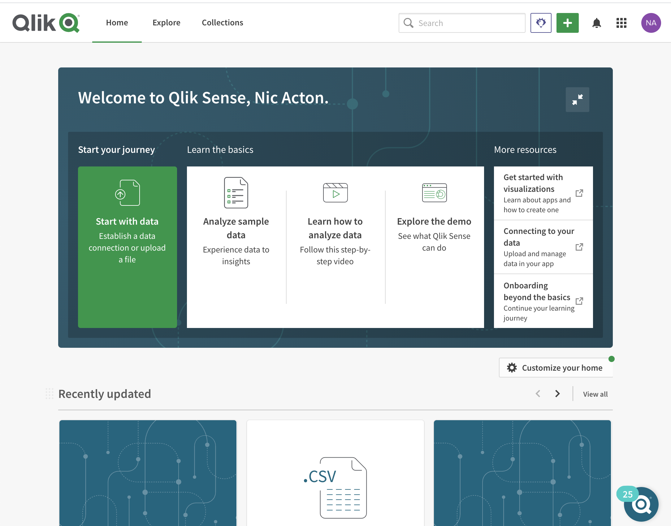
Either way, log into the Qlik Sense platform and you should be presented with an interface like this:
2. Get Your LinkedIn Data
In order to pull the data we need live and programmatically, we would need to utilize the LinkedIn Connections API. While this could be an extension to the project in the future, for this example we are going to go a much easier route that doesn't require understanding of more complex ETL through APIs/OAuth and just grab simple flat data exports directly from LinkedIn.
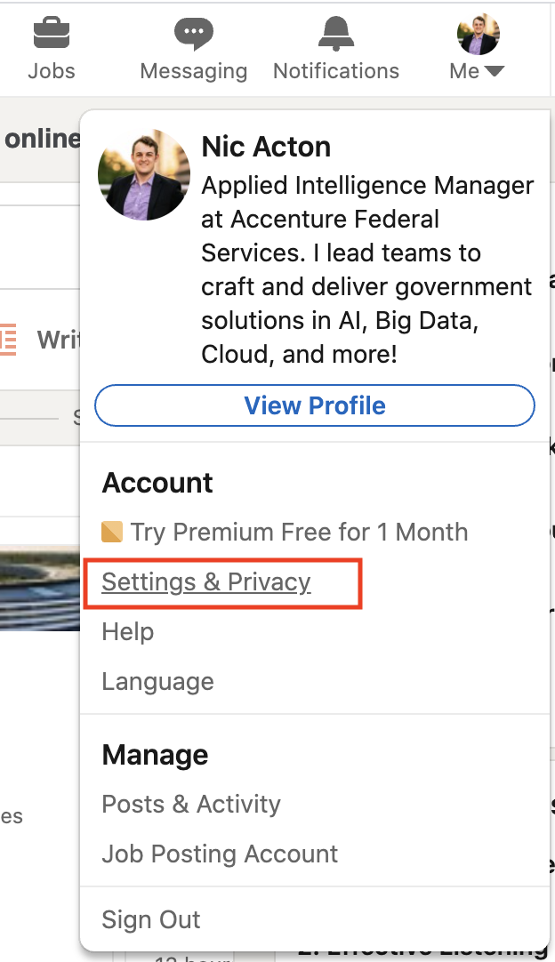
First, go to your "Settings & Privacy" for your profile.
 Then, select the following to request a CSV download link sent to your email. In this case we're only interested in our "Connections" but you can certainly request and perform interesting visualizations for just about every other piece of LinkedIn data you have.
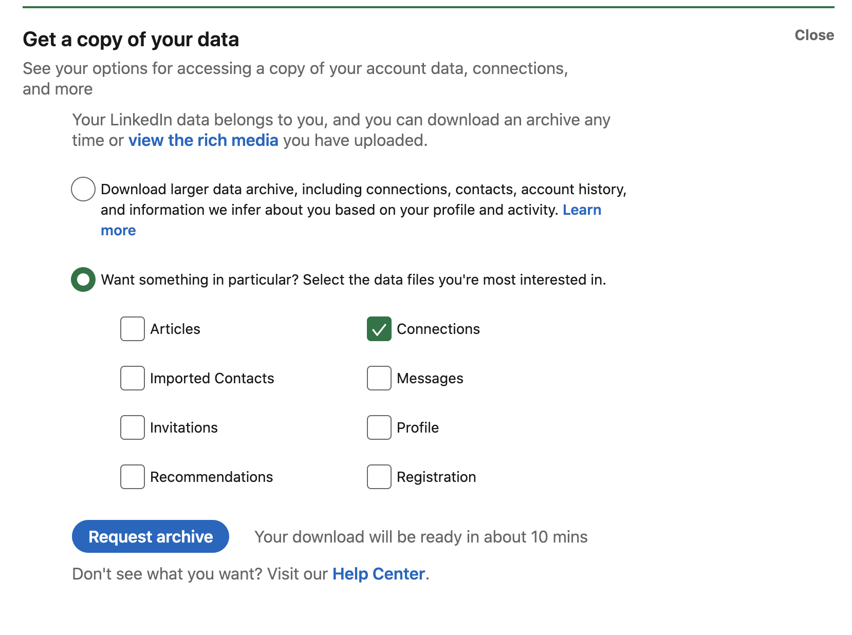
After around 10 minutes you should get the link and have your CSVs ready to go.
3. Create Your Qlik Sense App
Load Your Data
While there's many ways to start this project, we're going to simply start with a "New analytics app."
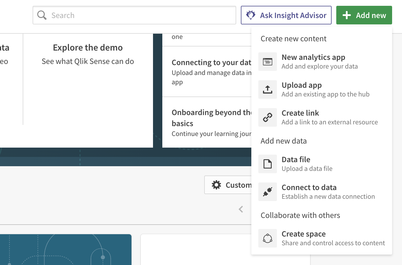
After selecting the "Add data from files and other sources" box in the middle we are presented with a space where we can simply drag and drop our "Connections.csv" file from our LinkedIn Data download.
The data export is admittedly a little odd so we'll need to configure some things before Qlik recognizes the schema of the file.
- We'll need to ensure Delimiter is set to "Comma"
- The headers are actually 4 rows down from from the top of the sheet, so we'll need to indicate that as well.
- While you don't have to do this, you can use this step to change the current column headers from the numbered labeling to ones that are more recognizable.

Then just hit the green button in the bottom right and your data is loaded!
Explore Your Data
Now that our data is loaded in we are presented with our application and we can start to dive into it. Go to the "Sheets" at the top of the screen, this will be the home of our charts, tables, and visualizations.
Traditional data visualization and exploration best-practices demonstrate that we should start with the highest level that we can first. Let's try to get a view of all the companies that I have contacts at.
The best way that I could think of is with a tree map. This is a very popular view for showing magnitudes associated with hierarchies. This will make more sense in a second.
We simply pull the tree map chart into our sheet to begin crafting it. For our Dimension, we select "company" and to indicate the number of connections we have at that company we'll just use "Count(first_name)" as our measure. This all translates to "what is the count, or number of, employees each company within the scope of my network?"
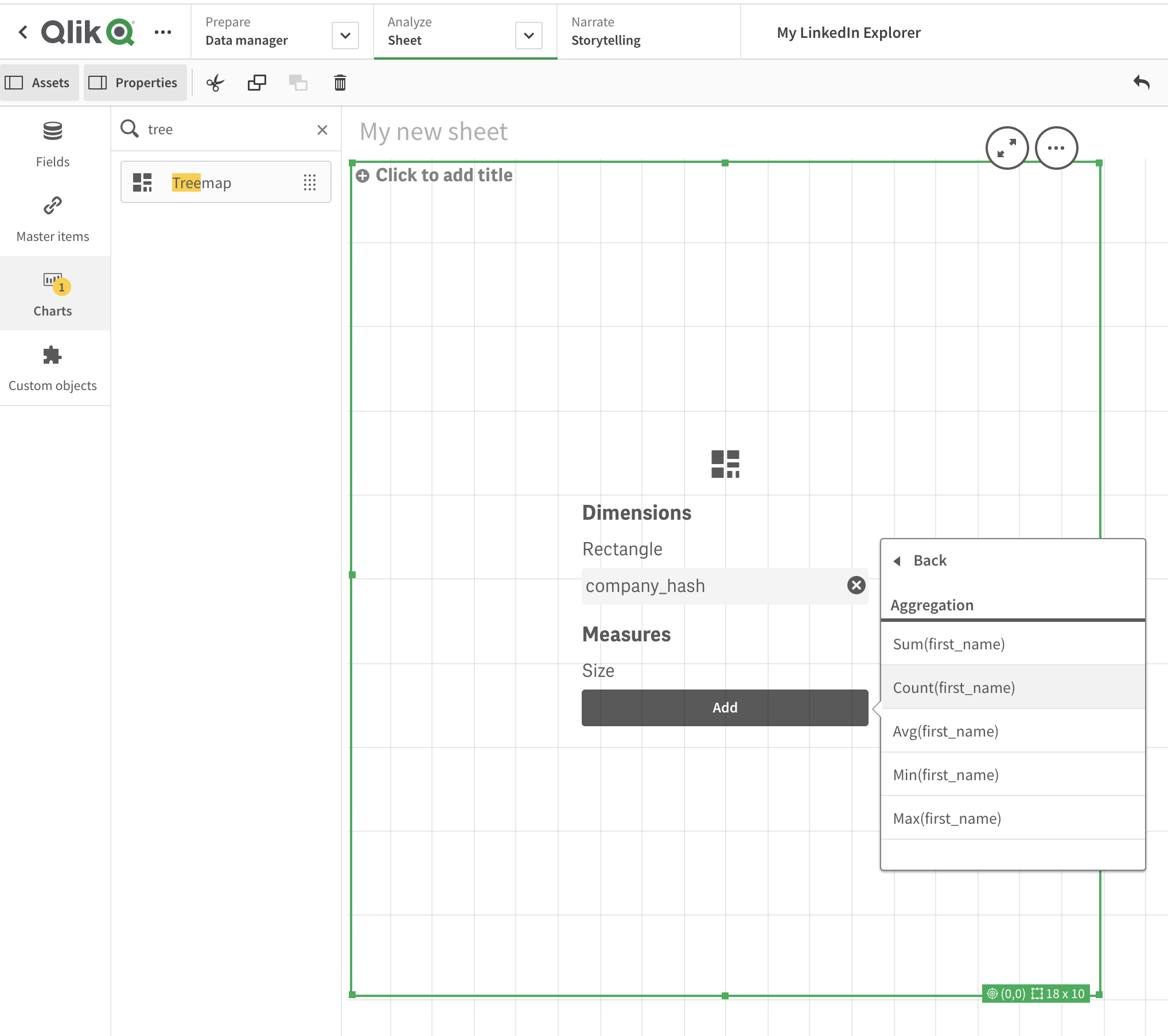
For the purposes of this demonstration and to protect the privacy of my network I have actually hashed each person's name and company to hide their details while still retaining functionality.
Great! Now we have a pretty comprehensive tree map of the density of my network at various companies. From here we can start to play with the appearance of this chart in order to make it more useful, such as using a divergent gradient or class of colors to show the size of our companies as opposed to just one single color.
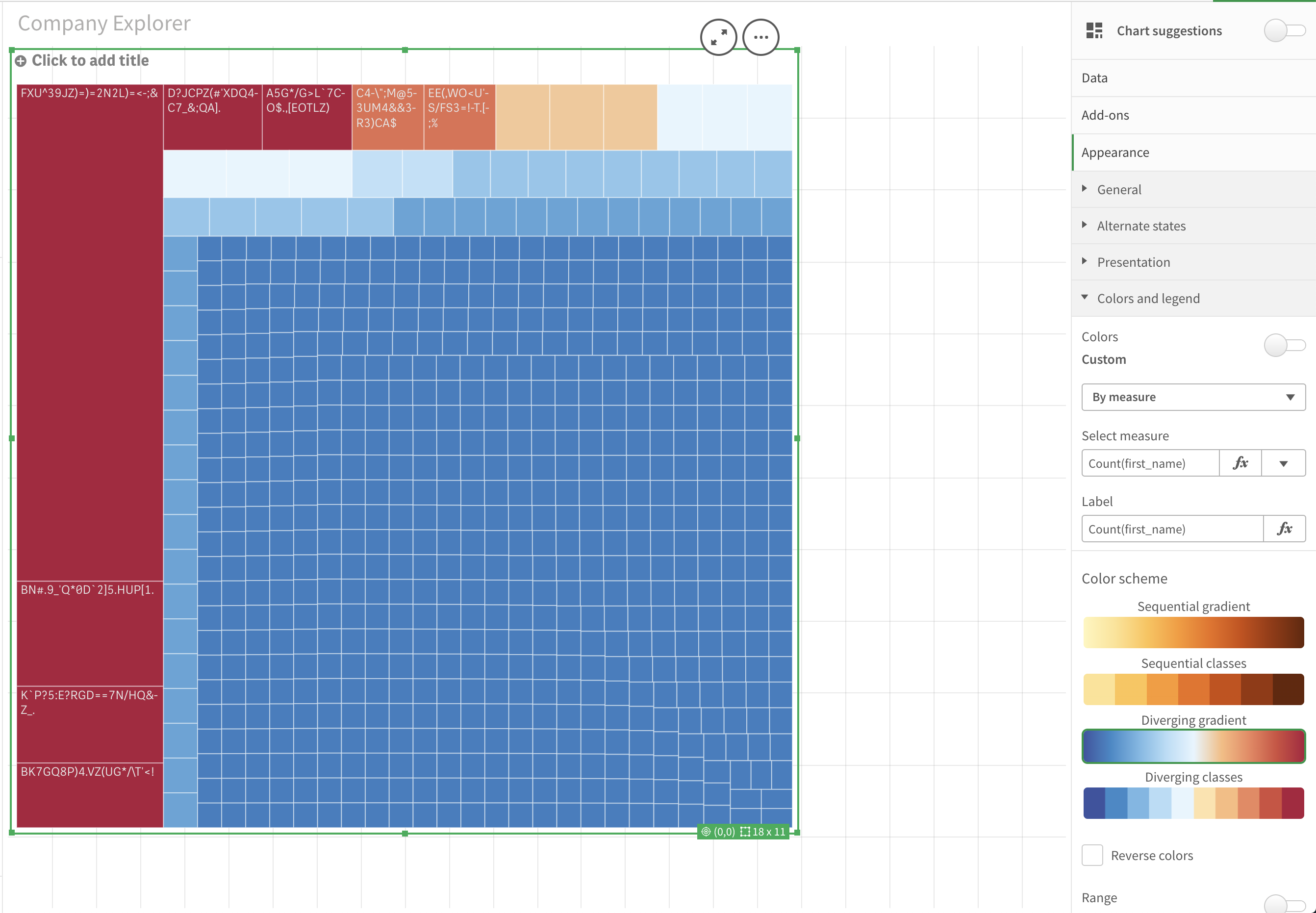
Answer Questions
Now we have a top level view of our data but ultimately what would we want to use this for?
The beauty of platforms like Qlik Sense stems from our ability to start with a top-level view and then dive deeper depending on the goal we're trying to achieve or question we're trying to answer.
Let's suppose you're trying to find your first job, you would likely want to start where your network already has recruiters as they will be able to get a look at your resume and get you past the resume robo-screeners (these are real, they're called Applicant Tracking Systems). When I add tables for the name and role of employees I can now filter through the "Roles" for recruiters. I now have a view of every company where I have a direct connection into their company recruiting pipeline.
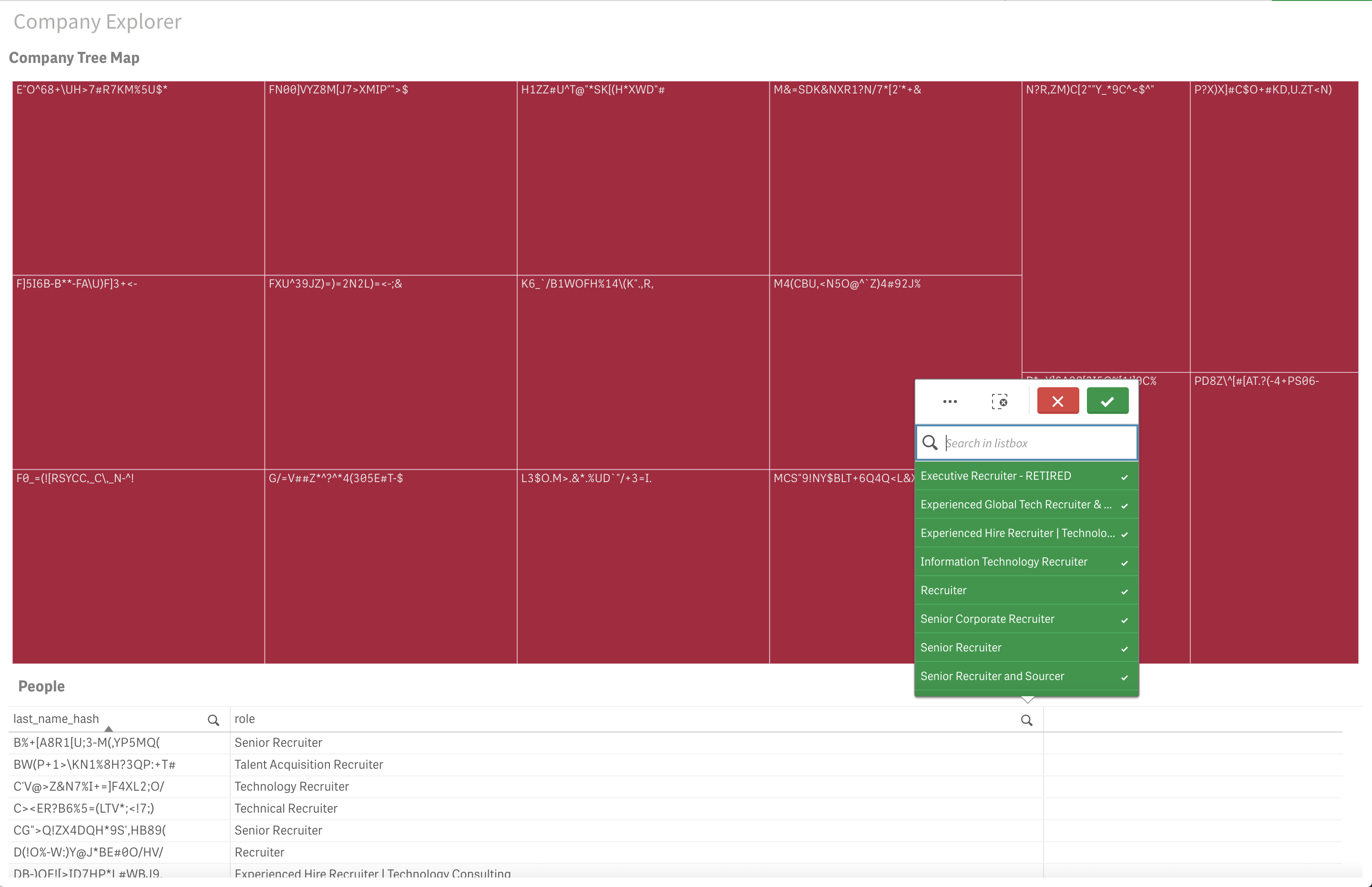
When I want to remove this filter, I simply click the big red X, hit "Esc", or remove it as a filter from the top left of my sheet view.
4. What's Next?
Now that you have a baseline to explore your network, there's definitely other ways you can progress.
Cross-walk with Other Datasets
Anyone can re-create what I just did in desktop tools like Excel. Where you really need to take advantage of platforms like Qlik Sense is the ability to model, correlate, and cross-walk between other datasets and APIs. After a little data cleaning, you could likely combine other data from companies like Crunchbase to get more in-depth analysis into questions like "how fast are the companies within my network growing?" or "what are the strongest/weakest overarching industries within my network?"
These are all exercises for another article.
Tell a Story
Lets say you actually want to use data like LinkedIn data to demonstrate to your Chief of Staff that there are distinct centers of excellence for your company that you are not recruiting from. Their time is immensely valuable, you can't waste it filtering and navigating through your visualizations. Qlik Storytelling is an emerging feature of the product that allows you to create presentations that will dynamically pull up pre-filtered views of your Qlik sheets in a slide-by-slide Powerpoint fashion.
Expand
With good, clean data and well-organized schemas, modern analytics tools can do amazing things. With some testing, your data can feed Qlik's Insight Advisor which allows you to ask human-language queries like "how many people work at Microsoft?" and get back clear answers and visualizations on the fly!


